Friday, June 5, 2015

Carving project


I arrived at my image by first starting with very few and thin lines, which represented calm water. As more carving went on, I decided to make more rough and intense water because I felt it was more visually appealing, as well as making thicker lines on the canoe to make it easier to see. I enjoy making intense pieces of art with lots of directional movement and things happening.
Printing on paper from the cork that we carved out was an interesting experience because of the way you can only make lines, no real texture inside the whites, only around the edges of the carvings, for example making rough lines to represent rough water, and smooth lines to represent calm water. Although it took a while(and was messy) to apply the ink to the block each time you wanted to print, the printing experience was better than just drawing directly on a piece of paper, because you can carve away the black very precisely. This form of printing, with no grays available, made the image a lot simpper, but even so, you could use directional movement to move the lines in a certain direction. I learned how to represent the movement of water, which was by overlapping lines in different directions. 
The way the three images read left to right, first on a simple white, second on a bright yellow, and third to a mellow gold, work well together because the background is transforming from one color to another. The group agreed the water was very well represented, and that there is not much to change about it. They recommended maybe trying to fit the boat more into the piece, where as now it seems sort of placed on top. Because the boat is the focus of the piece, it should be more clearly defined. 

Monday, May 18, 2015

Final Value project


ON CHARCOAL DRAWING

Placing the light on the page by erasing the dark away was very unique, and I found this to represent the value more than on a photograph because you could place exactly where the light was, and maybe exaggerate it in some parts. Techniques such as only erasing where the light actually hits and not outlining the objects allowed me to better represent the value. Working with charcoal made representing the value easier to accomplish because you can lightly erase the charcoal to get many grays or erase it all the way to get sold blacks and whites. The one downside with charcoal(besides being messy) is that it is hard to control exactly where you want your values because erasing isn't very precise. 

I stretched and explored because  I didn't have many different values in the beginning, but added a variety of more because of the eraser-pencil and white pencil that were introduced to us, which allowed to have very solid whites in some places. I also did not have the value of the cloth behind the objects in the beginning but later added it because I learned how to show a flow of value and represent that in the cloth. 

If I had to change one thing, I would have started out by lightly erasing where I wanted the values to be and not just adding them on over time, it would help with an overall view of the final product. 


ON VALUE in Drawing & Photography

Light and contrast were very important to both projects, but I feel more so in the charcoal project, which I also found the most success in, because you are physically placing the light on the page instead of just capturing it. This allowed for more expressive values because you could slightly modify where the light was actually hitting to have more values and show more light, unlike in photography where it was much more difficult to do this. 

Value is very important to pay attention to because lighting can change the mood of an entire piece. Art that is dark and contains almost no light sets a scary and mysterious mood where as very vibrant picture with lots o white sets a happy or excited mood on the piece. 

Thursday, April 23, 2015

Value Project


- Consider our focus on the Element of Value:  How did your practice capturing black and white photographs through our various daily practice routine afford you a deeper understanding of the power of light in art?
Lighting from different angles and reflecting it on different surfaces could make the light softer, if you let it only go through a limited amount of space as seen in the third image, which made a variety of grays. Backlighting causes intense black and whites when the camera is focused on the object, while side lighting makes the object have more grays while the background and surface it is on is black or white. 

-  Recall specific moments where you found or saw something that inspired your work in this project.
When I saw the woven grass sculpture outside, and saw the light partially shining through I thought it would be good for grays and in the third picture I used this. Another time, I saw light shining through the window in the sculpture studio, while the rest of the room was relatively dark, I thought this would be good for an intense black and white photo, and I used this for both the first and second photo.

-  How much did you expand your ability to observe “value” in your work?
When I first started taking the photos they were very simple and basic with boring lighting. I found that different angles of light and the amount of light around it majorly affected the photograph.

- Consider the habit “engage and persist”:  What did you learn technically (both in shooting and editing your photographs) through your engagement in the process of experimentation, analysis, and persistence?
In photography, you can't just take one photo and be done, you have to take many, many photos from different angles or slight adjustments for each lighting. Expirimenting with many different changes to a photo in both shooting it and editing is the best way to get the desired photograph. 

- What, specifically,  did you “learn” through the process of this project?
I learned that in photography, it is good to take many photos of the same object with slight alterations, because the chances are that one of those photos that you take will turn out well.

-Consider our work with composition during this unit.  Were you able to recall the earlier experiences you had experimenting with composition and apply that to your work on this project?  Do you feel like you have a better understanding of how to manipulate and utilize the aspects of composition in your art?
In previous expirences with composition, I learned that having the right object is very important. Too distracting, and it takes away from the rest of the photo. Too simple, and the photo is boring. The object I used was simple, but the curving shape made really interesting shadows and complimented the rest of the phtotgraphs. 

-To what degree do you agree or disagree with the class feedback you received in choosing your “best” image?  What new insights about your imagery did the class discussion about your work provide for you?
I slightly disagree, before the class discussion, my favorite image was the first one because I really liked the focusing and the many blacks and whites. The class decided that the second image was the best because of the two thirds and back lighting. I agree that it shows those two composition elements while the first doesn't really, but I still feel as if the first image is a better taken image and the second has more of the elements that we studied 


Monday, March 23, 2015

All three projects


I used the form and texture from your previous projects and took those and usde them in your new project. I looked at my previous pieces' form and textures and displayed them in my second sculpture. Although I used many of previously used forms, I explored with sticks and tying them down to create a new form. My second form sculpture was the most technical with string tying it down. The clay sculpture connected with both of my other projects, having leaves from my texture block and the form and flow of my second sculpture. The texture block was much simpler than the other two and was used a a base for them. The curve of the leaves were represented in my second sculpture while they were literally represented in my clay sculpture. Although I believe my second sculpture is the best because of its technicality, my clay sculpture had elements from both of the other two. 


Thursday, March 12, 2015

Greenware blog reflection

a. what excited you about the process of working with clay, of creating a an abstract form focused on texture? what are you most curious about?

Being able to form with a very maluable material such as clay made me excitedly do to use it. I am curious about seeing how the clay will form and bend to make it so I get what I want.


b. if you were to begin the clay sculpture anew, what is the most important piece of advice you would need?

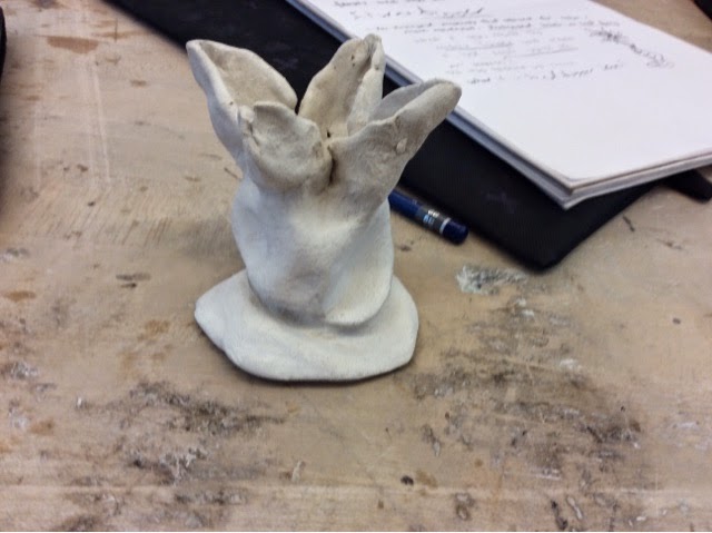
Make sure to keep the very thin clay pieces very moist so they don't crack up or dry. 

The most interesting replies made me think about making it bigger, more leaves, and making the base longer and spiral shaped.

I am excited for being able to make my sculpture in other materials than clay. Being able to have physical objects to create a sculpture is much different than clay because it is less maluable but you are still able to make things. Natural objects like twigs intertwined together to make the base with actual leaves being the leaves on my sculpture would be interesting for me to make. 

Thursday, March 5, 2015

Clay project

My sculpture starts with a solid bottom and blossoms into fragile top. It doesn't look very well made and smooth so I should improve that

Friday, February 13, 2015

square texture project


My six blocks. Three are "living" and three are not. 

The Browns and the Reds contrast each other with bright colors and darker

This one is symmetrical 

This one is also somewhat symmetrical, or matching blocks on each side. Red matches red, grey matches grey, brown matches brown etc.