Tuesday, June 6, 2017

Self Reflection


one. The map project and the artist's activism project were the projects that were most engaging to me. They allowed me to express all three ideas of an interesting conceptual, emotional and physical piece. In both, I felt especially motivated to finish the project and create something that made people think deeper about my project.

two. I think I have become more invested in the emotional and conceptual parts of my art much more than before this year. Before this year, I think I made projects solely because they were visually pleasing, and had no real deeper meaning behind them. I think this year, I have become more comfortable in creating something that is conceptually and emotionally interesting in addition to being visually pleasing.

three. My map project and activism project were the most successful as they expressed the three important aspects to me: visual, conceptual and emotional. The most frustrating piece was text in images because it was conceptual difficult. My ideas for what I should do constantly changed, and was hard to stay invested in one of them. It was hard to feel motivated to complete something that I wasn't fully or mostly invested it. I think my teacher allows for a project to be very broad, which can be good and bad. Projects that feel so broad, ex. text in images, make it hard on the student to gain inspiration on something. Additionally, projects that are broad can be good because they allow for more growth as the student isn't confined to one subject. I think starting the year with more focused and less broad projects and gradually making them more and more broad as the year goes on helps the student find what they like to create and how. 

Artists statement

I make art as a means of better understanding subjects I am interested in: the political, sociological, and economical questions of the world. Creating visually intriguing objects provides a different access point to consider the subject. I endeavor to create something that is visually pleasing when first seen, but under deeper inspection, it evokes emotions from the viewer and makes them think more about it.  I like to have a balance between the conceptual, visual and expressive elements of every sculpture I make.

I am most often drawn to wood and plaster to create my artwork; wax, clay, plastic, paper and other materials also come into play..  The flexibility in how each is able to be used allows me to explore the large amount of things I have interest in while keeping each of the sculptures based in the materials I enjoy manipulating. While creating my pieces, much of the materials I use and how I express reflect my feeling about something. The normally smooth and white plaster or the rough and dirty wood can also be transformed to the opposites. I like use the materials as how they are originally, as well as change them completely and change the perspective of how they might be used.

Thursday, November 3, 2016


I began my project with the idea of a head, cut in half, with computer parts coming out of the back. Computers are very prevalent in my life as well as American society as a whole, so having the representation of part of my head/brain being a computer comments on the reliance on computers in our lives.
When I first started my project, I thought of using a foam head to cut in half, then carve into, or simply glue the computer pieces to the back of it. I did this and it seemed very informal and the foam face did not represent me well. From there, I then used plaster gauze to form a face on top of a flat foam head. I wasn't satisfied with this either, it did not look human nor clean, so I decided to use it as a base for a clay face. I wrapped the clay around the head, from which I created the different facial features: eyebrows, eye sockets, lips, cheeks, etc. The dried clay looked much smoother and rock-like, similar to a marble bust that you'd find a museum, opposed to the rough plaster gauze or foam. If I would have redone this project, I would have started with clay, and not try to take the easy route of a foam head, which ended up not working for me due to it being not very clean, and looking more like a rough draft, not a finished piece. 
No artist in particular inspired me, but thinking of the smoothness and simple nature of busts you'd find in a museum made me want to make something similar to that for me, but with a twist.
Many of the comments talked about my interest in technology, and how the face looked like mine, and how it obviously was supposed to resemble my thoughts. Additionally, they talked about the point of view, and how it appears very smooth and formal from the front, but as you came closer you would notice that that wasn't the case. Perspective and self examination are the things that I want to continue to explore in other projects. I want to make art not just because it looks cool, but because it says something about me as a person. 

Tuesday, September 6, 2016


My original intentions of this project were to create a circular globe with red film covering it with a lightbulb inside. Then I would research the countries that consume the most energy per year, and the countries that consumed more would have less film covering them, allowing more light to shine through, and the countries that consumed less would have more film covering them up, allowing less light to shine through. I then changed my idea of a circular globe to a wooden cube (seen above), due to it being an easier 3d shape to make, and also having be more abstract. The ideas meant to be displayed in this project were supposed to be showing something statistic while also having an abstract art piece of the world; I wanted to explore the beauty of abstraction of information.

Wednesday, May 4, 2016

Growth and Destruction Sculpture

Consider our goals for this project:  Group collaboration, audience participation/interaction, 
Create a blog post.  Images collected are on the server for you to use as visuals.
There are three parts:  
1.  Reflection of the Process 
A.  describe the initial concept.  
The initial concept of our group sculpture was to create one that was interactive, attractive, and made the viewer think about what their actions caused. We wanted a sculpture that could be used by more than just the sense of sight; we wanted one that could use touch, sound, smell, and even taste. 

B.  What surprises came up for you in the process of creating this piece. (Interesting or inspiring Ideas, insights, opportunities that emerged in the process)
The transferring from our initial sketches to the final design. I think that the inspiration used from Rube Goldberg machines helped us a lot in where we landed with out final design. While creating the piece, it was surprising to see how a larger sculpture is created differently than a ceramic piece or something else much small. Doing things like digging holes, using exact measurements, etc. as opposed to just creating it from the mind shows the difference in a larger sculpture that requires may working components to a simpler one that does not. 

C.  Reflect on your participation in a group collaboration:  How well were you able manage and organize your work as a part of a larger collaborative team? To what degree were you able to assert your creative voice into the group?  What creative opportunities emerged as a result of collaboration (ways of working you would not have tried on your own.)
Having the initial meetings about what we were actually going to create was helpful with collaborating ideas. Being able to create a sketch and use it to give others inspiration while gaining inspiration from their ideas helped in creating a refined piece. Managing what one group or person would do in that class was relatively easy with the size of the class, and would normally be figured out at the beginning. With a group, we were able to create a piece much larger than one that would be created by myself. Using inspiration and help in construction of the piece from the group resulted in a collaborative effort. 
2.  Analyze the overall success of the product - conceptually, formally, aesthetically.  Consider observations of audience interaction during FAB as well as any direct responses.    
While watching the responses to the piece at FAB, it was generally successful in what we were trying to convey. Conceptually, the final result of the piece nearly matched our intentions, with almost all of the same core concepts(hammers almost hitting window, causing water to spill on a plant). At FAB, many people realized after swinging the hammers that they would not hit the window, and that they would cause the pitcher of water to splash some onto the plant. Aesthetically, we could have changed it to hide the watering can and plant, but the simplicity of the final design also caught many people's attention. 
3.  Consider your creative practice as a whole.  Compare working collaboratively to individual project development:  which is more comfortable?
Collaborative work allows for different ideas to be spread around and enables larger and more difficult creations. With smaller pieces, being individual is good because you are able to work on your own with something that can express only yourself. With a group, you are trying to express all of the groups ideas, which can be more difficult. I think being individual is more comfortable overall.
Where do you want to go in your artistic study for the remainder of the year?  What medium?   To what degree are you engaged conceptually, formally or expressively in your artistic practice (which areas are most important to you)?
I want to continue to explore with clay and the wheel. I like the idea of pottery and ceramics because the malublity of clay and the variety of the pieces that you are able to create. I enjoy working with the wheel because it is something that you need to learn and work on to be better at, and allows for the creation of many common items(plates, bowls, cups). Becoming knowledgeable in many different mediums of art is something I desire, but I would most like to continue working with clay. 

Monday, January 11, 2016


All of my selections were chosen because of the very perfect form. The "bulb" shape and nearly perfect circle attracts me because of the simplicity.

Friday, October 23, 2015

Artist Choice Blog

I chose the Holocaust Memorial by George Segal. I like this piece, and especially the expression and posture the man has. I feel a sense of hopelessness, and the quote "To love means loving the unlovable. To forgive means pardoning the unpardonable. Faith means believing the unbelievable. Hope means hoping when everything seems hopeless." by Gilbert K. Chesterton

Monday, October 19, 2015

BEAM Project

The first idea I had was very similar to the final result, a slightly humanoid figure that is very abstract, while being three dimensional. The addition of a cylinder representing a head reinforced the idea of a human even more. When deciding to pain one side of it while painting the whole head, it was meant to represent being clean on one side while rough behind, while the head was meant to be what all humans aimed to be in their head, perfect and smooth. The conflicting colors of black and white represented good and evil in human nature, black being core good beliefs while the white being the evil poking off of everyone.

The idea to make it more clear that I was trying to demonstrate contrast on the back of the sculpture compared to the front. I liked the idea of making the back stained and roughing it up so it was more apparent on what I was trying to do. My idea of a humanoid figure with contrasting colors was reinforced of others, and the idea of making the rough background more apparent is something that I'll keep in mind in the future, that I should try to make subtle things more apparent if it is not very clear at first.
My work overall was successful in displaying what I wanted to show, and I think I was able to craft to the best of my ability. I used a multiple of tools, whether it was to sand, carve, or cut out the wood. My final concept on paper almost exactly matched my final result on wood, which I was happy with. My personal expression through sculpting was successful because of the way the sculpture flowed and had directional moment, similar to my desires of what I wanted it to be.

Wednesday, June 10, 2015

Year In Review

one. looking back over the course of the year, and your blog posts, which project or projects were the most engaging for you? Where did you fully own your process as an artist? where did you get lost in the material or the making of work? 
I feel as if the final, relief print project, was the project that fully exemplified my skill as an artist, mostly because I had the most experience beforehand.  The relief project and the charcoal were both engaging because of the way we subtracted the black instead of adding it on. The most difficult project was most likely the photography project because it was hard to have light shine how you wanted. 
two. you have had a year of tremendous artistic growth. where do you see that you have grown the most? think about the studio habits as you answer and explain--observe, stretch and explore, craft, express, understanding the art world, reflect. which of these areas do you feel the most comfortable with? how do you see that comfort showing up in your creative practice?
I feel the most comfortable in my ability to stretch and explore different ways to display what I want on the material. This comfort shows in my work because I enjoy making many different drafts to see how they work differently. This exploration helps with discovering how to do something. 
three. think about the things we've studied this year--line, form, shape, color, pattern, texture, positive & negative space. discuss a few of these terms that are the most engaging for you. what have you learned about them? how do you have a better understanding of them?
Negative and Positive space are the most engaging because they change the mood of a piece drastically. If a piece is mostly dark, it has a sad mood , where if a piece has a lot of whites, it has a lighter mood. Texture is also engaging because it can change the look very 
four. course evaluation. which assignments were the most successful? which assignments were the most frustrating? What are one or two things that Mr. O/Ms. Seal do really well? What is one important peice of advice that you would offer your teacher so that they could make this class better?
The most successful projects were the charcoal and relief print projects. The most frustrating project was the value photography because of depending on the time/type of day the lighting could change, and it was very hard to control the lighting. One thing Mr. O does well is explain how to convey what you want on the material. One bathing that could be better is more options during each project besides just what you want to draw/paint/photograph, such as in the sculpture project, when we could decide between clay and plaster. 

Friday, June 5, 2015

Carving project


I arrived at my image by first starting with very few and thin lines, which represented calm water. As more carving went on, I decided to make more rough and intense water because I felt it was more visually appealing, as well as making thicker lines on the canoe to make it easier to see. I enjoy making intense pieces of art with lots of directional movement and things happening.
Printing on paper from the cork that we carved out was an interesting experience because of the way you can only make lines, no real texture inside the whites, only around the edges of the carvings, for example making rough lines to represent rough water, and smooth lines to represent calm water. Although it took a while(and was messy) to apply the ink to the block each time you wanted to print, the printing experience was better than just drawing directly on a piece of paper, because you can carve away the black very precisely. This form of printing, with no grays available, made the image a lot simpper, but even so, you could use directional movement to move the lines in a certain direction. I learned how to represent the movement of water, which was by overlapping lines in different directions. 
The way the three images read left to right, first on a simple white, second on a bright yellow, and third to a mellow gold, work well together because the background is transforming from one color to another. The group agreed the water was very well represented, and that there is not much to change about it. They recommended maybe trying to fit the boat more into the piece, where as now it seems sort of placed on top. Because the boat is the focus of the piece, it should be more clearly defined. 

Monday, May 18, 2015

Final Value project


ON CHARCOAL DRAWING

Placing the light on the page by erasing the dark away was very unique, and I found this to represent the value more than on a photograph because you could place exactly where the light was, and maybe exaggerate it in some parts. Techniques such as only erasing where the light actually hits and not outlining the objects allowed me to better represent the value. Working with charcoal made representing the value easier to accomplish because you can lightly erase the charcoal to get many grays or erase it all the way to get sold blacks and whites. The one downside with charcoal(besides being messy) is that it is hard to control exactly where you want your values because erasing isn't very precise. 

I stretched and explored because  I didn't have many different values in the beginning, but added a variety of more because of the eraser-pencil and white pencil that were introduced to us, which allowed to have very solid whites in some places. I also did not have the value of the cloth behind the objects in the beginning but later added it because I learned how to show a flow of value and represent that in the cloth. 

If I had to change one thing, I would have started out by lightly erasing where I wanted the values to be and not just adding them on over time, it would help with an overall view of the final product. 


ON VALUE in Drawing & Photography

Light and contrast were very important to both projects, but I feel more so in the charcoal project, which I also found the most success in, because you are physically placing the light on the page instead of just capturing it. This allowed for more expressive values because you could slightly modify where the light was actually hitting to have more values and show more light, unlike in photography where it was much more difficult to do this. 

Value is very important to pay attention to because lighting can change the mood of an entire piece. Art that is dark and contains almost no light sets a scary and mysterious mood where as very vibrant picture with lots o white sets a happy or excited mood on the piece. 

Thursday, April 23, 2015

Value Project


- Consider our focus on the Element of Value:  How did your practice capturing black and white photographs through our various daily practice routine afford you a deeper understanding of the power of light in art?
Lighting from different angles and reflecting it on different surfaces could make the light softer, if you let it only go through a limited amount of space as seen in the third image, which made a variety of grays. Backlighting causes intense black and whites when the camera is focused on the object, while side lighting makes the object have more grays while the background and surface it is on is black or white. 

-  Recall specific moments where you found or saw something that inspired your work in this project.
When I saw the woven grass sculpture outside, and saw the light partially shining through I thought it would be good for grays and in the third picture I used this. Another time, I saw light shining through the window in the sculpture studio, while the rest of the room was relatively dark, I thought this would be good for an intense black and white photo, and I used this for both the first and second photo.

-  How much did you expand your ability to observe “value” in your work?
When I first started taking the photos they were very simple and basic with boring lighting. I found that different angles of light and the amount of light around it majorly affected the photograph.

- Consider the habit “engage and persist”:  What did you learn technically (both in shooting and editing your photographs) through your engagement in the process of experimentation, analysis, and persistence?
In photography, you can't just take one photo and be done, you have to take many, many photos from different angles or slight adjustments for each lighting. Expirimenting with many different changes to a photo in both shooting it and editing is the best way to get the desired photograph. 

- What, specifically,  did you “learn” through the process of this project?
I learned that in photography, it is good to take many photos of the same object with slight alterations, because the chances are that one of those photos that you take will turn out well.

-Consider our work with composition during this unit.  Were you able to recall the earlier experiences you had experimenting with composition and apply that to your work on this project?  Do you feel like you have a better understanding of how to manipulate and utilize the aspects of composition in your art?
In previous expirences with composition, I learned that having the right object is very important. Too distracting, and it takes away from the rest of the photo. Too simple, and the photo is boring. The object I used was simple, but the curving shape made really interesting shadows and complimented the rest of the phtotgraphs. 

-To what degree do you agree or disagree with the class feedback you received in choosing your “best” image?  What new insights about your imagery did the class discussion about your work provide for you?
I slightly disagree, before the class discussion, my favorite image was the first one because I really liked the focusing and the many blacks and whites. The class decided that the second image was the best because of the two thirds and back lighting. I agree that it shows those two composition elements while the first doesn't really, but I still feel as if the first image is a better taken image and the second has more of the elements that we studied 


Monday, March 23, 2015

All three projects


I used the form and texture from your previous projects and took those and usde them in your new project. I looked at my previous pieces' form and textures and displayed them in my second sculpture. Although I used many of previously used forms, I explored with sticks and tying them down to create a new form. My second form sculpture was the most technical with string tying it down. The clay sculpture connected with both of my other projects, having leaves from my texture block and the form and flow of my second sculpture. The texture block was much simpler than the other two and was used a a base for them. The curve of the leaves were represented in my second sculpture while they were literally represented in my clay sculpture. Although I believe my second sculpture is the best because of its technicality, my clay sculpture had elements from both of the other two. 


Thursday, March 12, 2015

Greenware blog reflection

a. what excited you about the process of working with clay, of creating a an abstract form focused on texture? what are you most curious about?

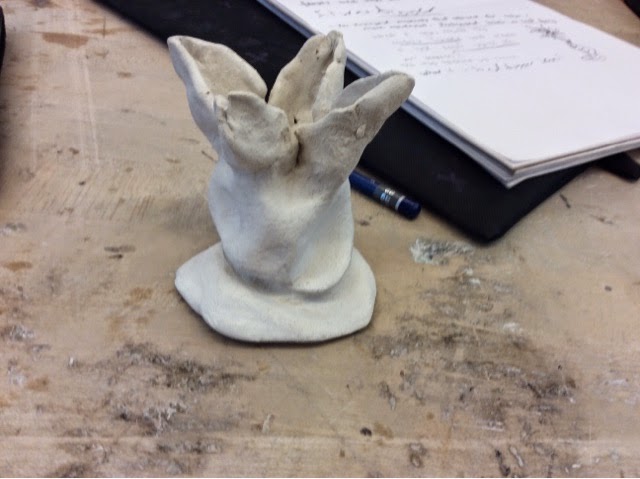
Being able to form with a very maluable material such as clay made me excitedly do to use it. I am curious about seeing how the clay will form and bend to make it so I get what I want.


b. if you were to begin the clay sculpture anew, what is the most important piece of advice you would need?

Make sure to keep the very thin clay pieces very moist so they don't crack up or dry. 

The most interesting replies made me think about making it bigger, more leaves, and making the base longer and spiral shaped.

I am excited for being able to make my sculpture in other materials than clay. Being able to have physical objects to create a sculpture is much different than clay because it is less maluable but you are still able to make things. Natural objects like twigs intertwined together to make the base with actual leaves being the leaves on my sculpture would be interesting for me to make. 

Thursday, March 5, 2015

Clay project

My sculpture starts with a solid bottom and blossoms into fragile top. It doesn't look very well made and smooth so I should improve that

Friday, February 13, 2015

square texture project


My six blocks. Three are "living" and three are not. 

The Browns and the Reds contrast each other with bright colors and darker

This one is symmetrical 

This one is also somewhat symmetrical, or matching blocks on each side. Red matches red, grey matches grey, brown matches brown etc.

Thursday, February 5, 2015

Pop art paintings

1.  Describe your intentions (envision)

I chose a stapler as my object because it has flat surfaces but also had many different dimensions/levels. I chose blue as my color because dark blue and light blue compliment each other better than other colors. 

2.  Describe process:  How did you engage and persist toward your goals?  How well did you develop craft?

I engaged and persisted towards my goals by following my different shades and made sure I placed them where they were supposed to go. Although some of my edges of my object aren't very clean, I tried to keep the very different colors, such as the dark blue and the light blue, from touching each other and blending. 

3.  Assess your degree of success based upon your observations (directly of your work and those received from your peers)

I did not use brush strokes very well on my actual object but my background had a good texture and the color of the background allowed for the object to "pop" off the page. 


Thursday, December 18, 2014

Dot project


For this picture I portrayed the red berries by using different sized circles that are the same color as the berries. I represented the leaves by also using different colored, different sized, and differently rotated circles along the outside of the red dots. The background is a light pink because while I wanted it to look like the background in the picture, I didn't want it to be too intrusive and take attention away from the main part.


This picture is a spilt complementary of purple, red, green and yellow. In my composition, I had it transition from dark shades such as purple and dark red-ish orange to light colors like yellow. In the middle it is a mix-up of all colors representing the middle of the actually picture. For the background I chose a green because it contrasted well against the other colors and felt like it made them pop.

Friday, November 21, 2014

Pictogram

Shape collage focused on composition. 


Pictogram:


REFLECT
Look at your 2-3 rayograms and paper cut-out creations. 

What compositional styles where you drawn to? (pattern, rhythm, directional movement et cetera). How do the shapes of the objects relate to one another on the page? Choose one collage and one print as your most compelling work and explain why. 

I used balance(symmetry) and center of interest in both my collage and my print. In my pictogram(print), there was only three different objects I used, leaves, toothpicks and balls so they all relate to each other. They also related to each other because they pointed at a center object. In my collage, the border is symmetrical, and there is a center of interest in the right corner. These two works of art are the best in my opinion because they used the most amount of elements of composition composition. 

DEVELOP CRAFT
Working in the darkroom can be challenging. There are a lot of technical and mechanical components to keep in mind. Make an outline of your process in the darkroom, go through the steps of making a print. (you do not need to write in complete sentences). 

•Find objects that are interesting and are not just dull shapes

•take the object and put them under the enlarger, and choose the amount of time around 10 seconds, and the aperture around three clicks. 

•after waiting about ten seconds when the light turns off, take the paper and place it in the developer chemical for 1-2 minutes

•then put the paper in the fixer for 2-5 minutes

•you then put it in the water wash for 4 minutes

•after this you can bring it outside to see if you like it and is worth saving

•if it is, put it in the permawash for 4 minutes. 

•finally, put it in the water wash for around ten minutes. 


HABITS OF MIND
Look at the Artist Habits of Mind. Besides, Develop Craft & Reflect, which habit did you excel at with this “Shape and Composition” project (consider all facets of the project)? Which habit did you struggle with? Give a little explanation about why you chose each one.

I excelled with the envision habit of mind by envisioning what the final result would look like, and making sure I would like it if it looked like that. I had a hard time with actually expressing my visions on to the paper using objects because the objects I used sometimes did not turn out the way I wanted them to. 


CONSIDER FEEDBACK

Following our guided group discussion, reflect on the insights and observations provided by your peers.  Which comments reinforce your intentions?  Which formal evaluations caused you to stop and see your work in a new way?  

They liked the flow of my work with the leaves , so I kept using those. They said they didn't like how dull some of the other shapes were, such as the small fuzzball things, so I didn't use nearly as many of those because I could see how they were uninteresting. 


Monday, November 17, 2014

Rayogram/pictogram

I like that my pictogram has direction movement through the leaf and the balls following it. I would change it so the mesh is not there and instead have more balls because I feel like the mesh looks out of place.